















Why does cybersecurity branding all look the same?
Cybersecurity branding looks the same because most security companies brand the fear, not the product. Shields, padlocks, glowing network globes, hooded figures and green code on black are shorthand for 'security', so they say the category and nothing about the company. When a CISO sees ten vendors in a week, those cues blur together.
The second problem is fear selling. Headlines about breaches and threat actors get attention, but security buyers hear that pitch every day, and it reads as noise. What earns their attention is precision: the exact problem you remove, the systems you cover and the proof that you do it well. Our article on moving past shields, locks and dark mode covers the visual side in more detail.
A strong security brand can still be serious, dark or technical. The difference is that its choices come from the product, the buyer and the way you work, not from a stock-image search for 'cyber'.
What should a cybersecurity brand say instead?
A cybersecurity brand should say, in plain words, what you protect, from what, for whom and how you prove it. Technical buyers reward specificity and punish vagueness, so the verbal identity matters as much as the logo. 'AI-powered protection for the modern enterprise' fails the test. A sentence that names the asset, the threat and the result passes it.
- Name the asset: identities, endpoints, cloud accounts, code, email, OT systems.
- Name the job: detect, prevent, prioritize, prove compliance, respond faster.
- Name the buyer: a security engineer, a SOC lead, a CISO or an IT generalist at a small company. Each needs a different tone.
- Show the method: how detection works, what data you look at, what you don't touch.
- Keep the tone calm: confident and exact, with no fear, no hype and no exclamation-point urgency.
We write the positioning and voice first in every sprint, because the visual identity should express a clear message, not stand in for one.
What does a security startup brand system include?
A security startup brand system includes the core identity plus the parts security products lean on more than most: data visualization, severity colors and product UI rules. Alerts, risk scores and dashboards are where your brand lives day to day, so we design them as part of the identity, not as an afterthought for the product team.
Part of the system | What we decide | Why it matters in security |
|---|---|---|
Positioning and voice | Message, tone, words to use and avoid | Technical buyers judge you on precision first |
Logo and wordmark | A mark that isn't a shield or lock | Stands apart in a vendor list or a booth wall |
Color roles | Brand colors kept apart from severity colors | Red and amber must mean risk, not decoration |
Type | A readable face for dense data and code | Logs, tables and IDs must stay legible |
Iconography | Icons for assets, threats and states | Avoids generic padlocks on every feature |
Data visualization | Charts, graphs and score styles | Risk and coverage are core to the product story |
Website and UI direction | 10 explorations of site and product screens | Tests the brand where buyers actually see it |
The sprint delivers Figma files for all of this. It's design only, so if you need the site built, we follow with the website package.
What does a cybersecurity SaaS website need?
A cybersecurity SaaS website needs product proof, a trust center and the details a security reviewer looks for, in addition to the usual home, product and pricing pages. Security buyers are often the most demanding reviewers of your own security, so the site has to show you practice what you sell.
- Trust center: certifications, policies, subprocessors and a security contact, often on a trust subdomain. See our guide to trust center design.
- Certifications in the right place: SOC 2 or ISO 27001 near the top of key pages, shown correctly. Our guide on displaying SOC 2 and ISO 27001 covers placement.
- Product views: real interface, with anonymized or synthetic alerts, not a glowing globe.
- Integrations: the SIEMs, clouds, identity providers and ticketing tools you connect to.
- Docs and technical depth: architecture notes, deployment options and data flow for the engineers on the buying team.
- A clear way to talk to someone: demo requests that route to the right person quickly.
Our list of must-have pages for a cybersecurity startup explains what to build first when you can't build everything at once.
How do you show a security product without exposing anything?
Show the real interface with synthetic data that behaves like the real thing. Security buyers want to see the product, but screenshots from production can leak customer names, IP ranges, hostnames or detection logic. We rebuild key screens in Figma or code with realistic fake data, so the views are accurate in structure and safe to publish.
We usually pick three or four moments that carry the product story: the first alert, the triage view, the investigation and the report or fix. Each gets a short caption that says what the user is looking at and what they do next. Motion helps here, for example an alert arriving and being grouped, but only when it explains something. Our article on security dashboard design covers how to show signal over noise inside the product.
What cybersecurity work have we done?
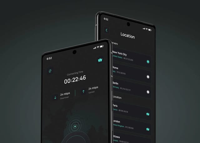
We designed the Wirefox VPN mobile app, including a distinct brand identity and the full app UI. The brief was to make privacy and security features feel simple and trustworthy for people who don't want to read about protocols. That meant a clear visual system, plain labels and an interface where the protected state is obvious at a glance.
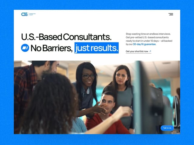
We also rebuilt the site for CSSinc.ai, a US-based enterprise IT consultancy selling into regulated sectors such as healthcare, finance and energy. The previous project had stalled. We rewrote the narrative, built custom modules for each sector in Framer, stripped out heavy assets, and took the site live in 21 days. Your timeline will depend on scope, and we set it on the intro call.
How does our process work for a cybersecurity startup?
Intro call
A free 30-minute call about your product, buyer and current brand. We'll say whether a sprint, a website or both make sense.
Positioning and voice
We write the core message: the asset, the threat, the buyer and the proof. This shapes every visual choice that follows.
Identity
Logo, color roles kept apart from severity colors, type, icons and data visualization rules, all in Figma.
Website and product explorations
Ten explorations that apply the brand to real screens: the home page, the trust center, a dashboard and an alert view.
Build the site
If you continue, we build the website in Next.js with a CMS, including the trust center and product pages.
Launch and handover
Tracking for demo requests, SEO checks, and a handover so your team can keep certifications and policies current.
What does cybersecurity branding cost?
Our brand and design sprint is $3,000, fixed. It covers a brand refresh or new identity plus ten website or product explorations, delivered as Figma files. Typical ranges we see quoted for brand identities run from about $5,000 to $50,000 and vary with scope and agency size.
- Brand and design sprint, fixed
- $3,000
- Website build, up to 6 pages
- $8,000
- Trial week before you commit
- $1,000
If you need the site as well, our website package is $8,000 for up to six pages, including copy, design and a Next.js build. Our guide to cybersecurity website cost and agency selection helps you compare quotes. We don't give a fixed duration for the sprint, and website timelines are scoped on the intro call.
The next step is a free 30-minute call. Bring your current site and your most recent sales deck.